Basic structure
Structuring pages for readability without styles and layout.
Page structure
Web pages are often designed with multiple columns, sections, colours and other visual aspects that organize the information. For those who cannot understand this content presentation, a screen reader or braille display is used.
Other users may change the presentation of the page, increasing text size, changing colours or contrast, or reducing the content to one column. It is important that when the content of the web page is “linearized” it continues to function and convey information clearly.
What to check
- The information makes sense when read in the order shown. Headings are right above the information they apply to.
- The alternative text provides adequate information for the missing images. See Text Alternatives for more information.
- Blocks of information have clear headings. See Headings for more information.

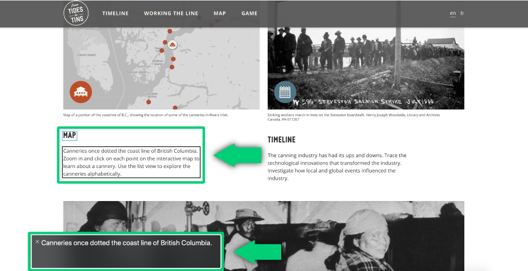
Page from From Tides to Tins with excerpt of what a screen reader will read

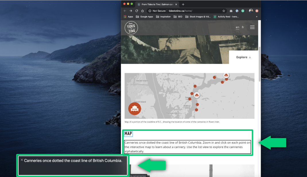
Page from From Tides to Tins enlarged to showcase linearized version