Feedback forms and errors
Using accessible indicators and error messages.
Form accessibility
Keyboard access, clear instructions, and effective error handling are important for form accessibility. When these fields are marked up correctly, users can interact with them using only the keyboard, voice input, or a screen reader.
Ensure that the required feedback forms are accessible and respond correctly by alerting the user to any incorrectly completed fields. The feedback/error message should be correctly interpreted by and read aloud to screen reader users.
What to check
- All form controls are keyboard accessible.
- Any fields that are required are clearly indicated and the indicator does not rely on colour alone.
- All instructions for completing the form are given before they are needed.
- Validate user input in form fields to help avoid content mistakes in submitted forms.
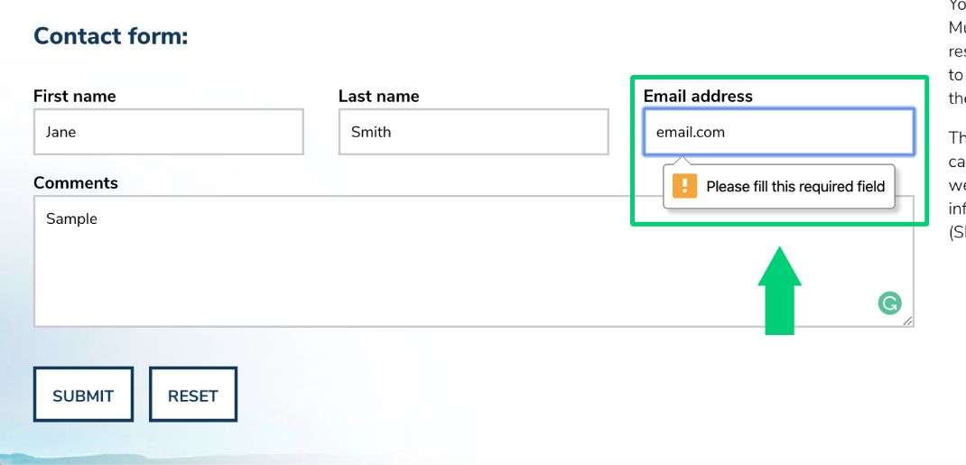
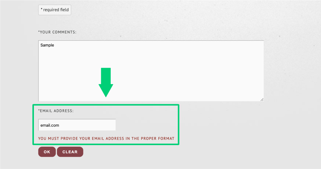
- Some forms might produce error messages if content was incorrectly filled out. If errors may occur:
- Clear and specific guidance is provided to help users understand and fix any errors.
- Errors are easily found. It is generally better if the error message appears before the form rather than after.
- Fields without errors remain populated with entered data, unless the content is sensitive, like a credit card number, then ensure the user knows to re-enter this content.

Error notifications from Navigating on the St. Lawrence

Error notifications from Radical Reform